#3 – SHINAGAWA-DORI |
|
|

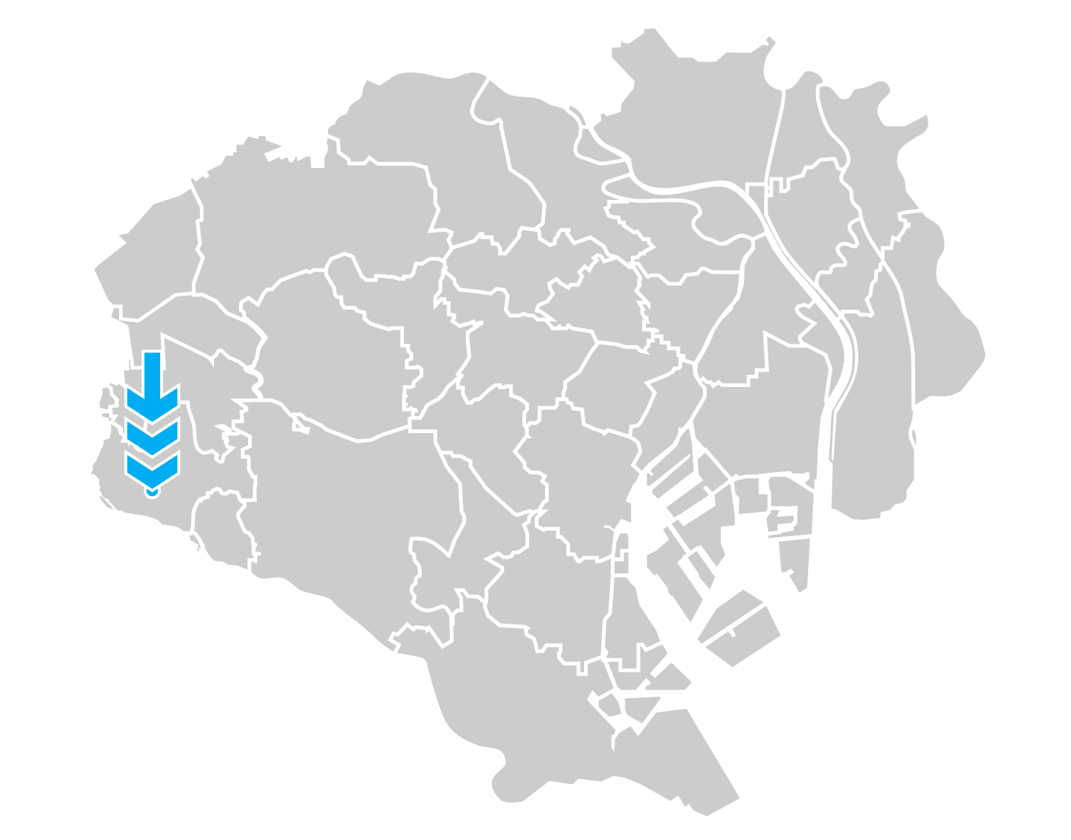
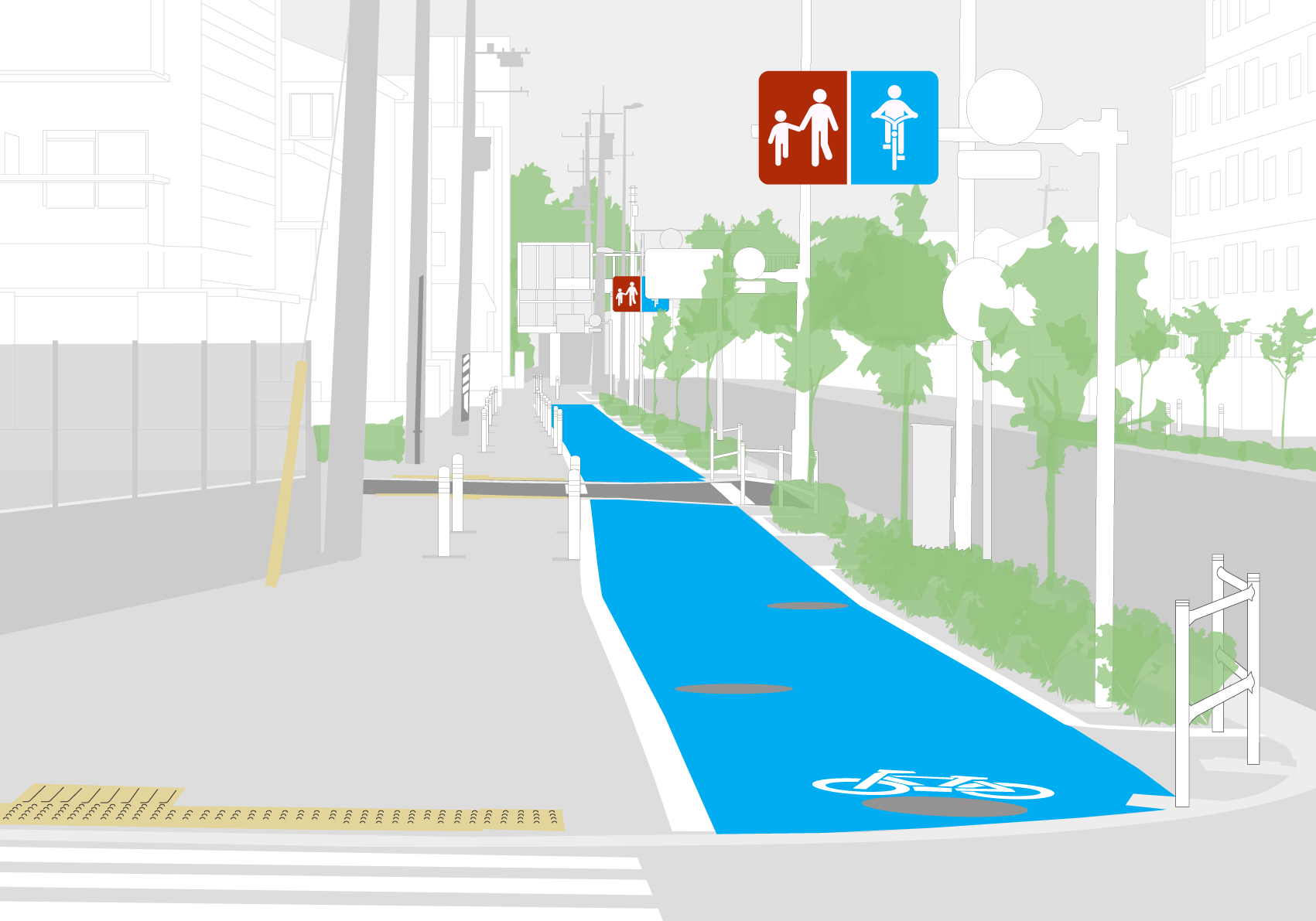
The bike lanes on both the north and south side of Shinagawa-dori in the Chofu neighborhood of Tokyo run for approximately 500 meters. This is a sidewalk lane where approximately half the sidewalk was divided to create separate space for pedestrians and people on bikes. The lane for riders is clearly delineated from pedestrians with bright blue paint and bike markings. It is also(somewhat) separated from pedestrian space with white posts every 20 meters or so. As with nearly all lanes built on sidewalks riders are separated from motor vehicle traffic by raised curbs. Here planters full of flowers have also been added. The lane ends abruptly at both ends where the sidewalk starts to narrow. Because sidewalk space is utilized instead of road space there is no motor vehicle traffic/speed calming effect from this design – which creates potential for collisions at corners along the route.
SAFETY RATING ( 6.8 )
Transition points – This is a sidewalk bike lane and most users entering this space prefer to approach it on the foot path rather than risk the road. The start and end are well signed and have a slight bump on the curb.
Cohesion – Unfortunately it does not connect to any other official bicycle infrastructure. But it is very close to it. We don’t understand why they couldn’t just put in a little extra effort to get these to connect. Tsurakawa-kaido has a bike lane that almost meets Shinagawa-Dori where this bike path is. They just don’t meet up. The route to the station and the newest bike path near the station is not officially connected but users just ride on the sidewalk until they get there.
Obstacles – Road edges have a bump so every engagement with a cross road means the users have to experience a tiny kick in the ass. Also, manhole covers litter the bike path and can get slippery when wet. Bollards are placed in ill defined sections of the bike path where planners just gave up and failed to provide a bicycle traffic solution.
DESIGN RATING ( 8 )
Communication – The blue paint of the bike lane is the most powerful indicator that this bike path is for bike use. There are faded stencil bicycle ground markings and two different bicycle signs (pogostick and bike-ped-share).
Understandable – For the most part all signage is pictographic outside of the “zebra share” crossing stencil with the standard hiragana (じてんしゃ)
Promotes Safety – All sidewalk based bicycle paths are inherently dangerous because pedestrians are free to move in and out of the bike path. At each major intersection the bike path disappears and cyclists go in many directions without instruction on how to safely traverse the space. It is separated from road traffic and it is safer on the path than on the road.
Transition Instructions – None. This is a failure.
USEAGE RATING ( 8.5 )
Popularity – Surprisingly this short bike path is very popular. The farther we go out of the core of Tokyo the higher the percentage of people on bikes. The usage seems to be consistent throughout the day. I’m sure it would be even more popular if it was connected to Chofu Station.
Broad Spectrum – There are many type of bikes on this path including some adult tricycles. Children do use this with their parents and it is popular with the elderly.
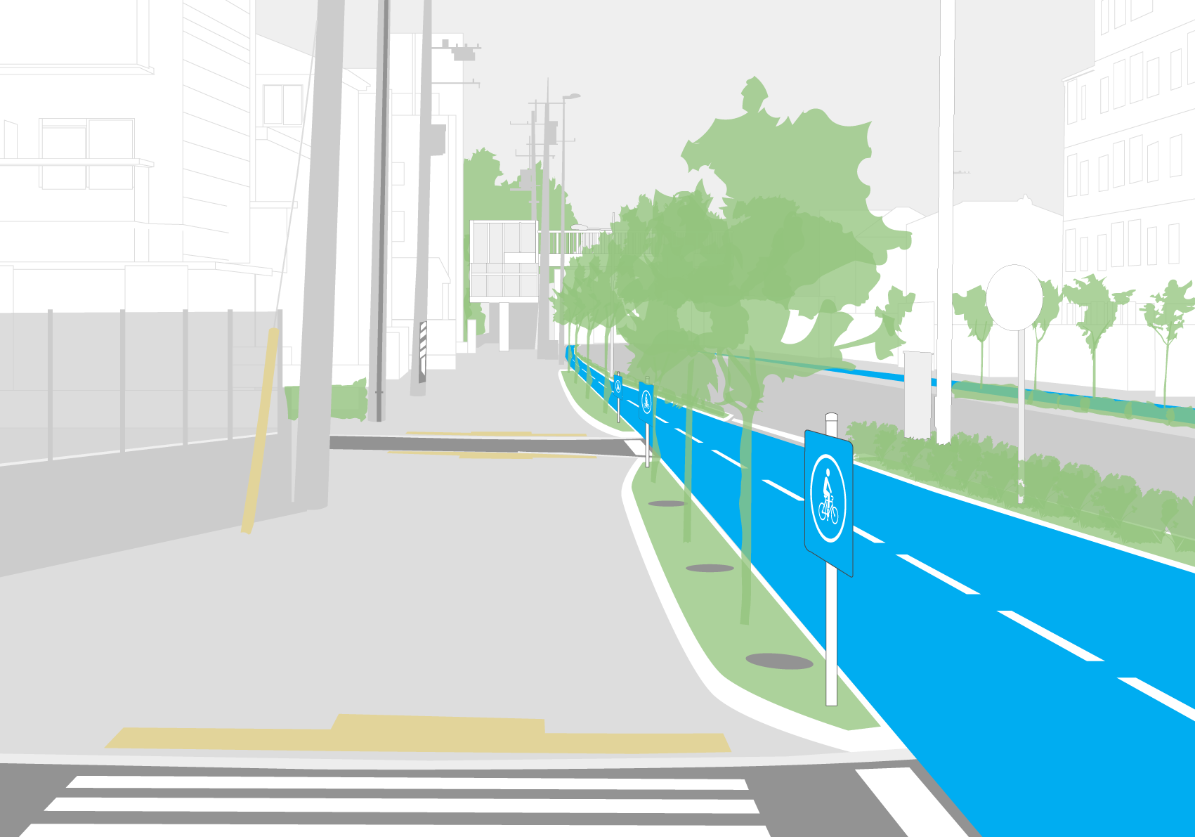
Scalable – Sidewalk based bike paths can be expanded but at the expense of pedestrian paths. The ideal situation would be for vehicular areas to be narrowed in favor of more space for cyclists. However, this meter wide path on both sides of the road seems to be sufficient for the needs of the current ridership.
Majority Preference – Even with the curb bumps and pedestrians in the bike path, most cyclists prefer to use the bike path rather than the road. This also says something about how unsafe people feel cycling in traffic.
Total 23.33 / 合計 23.33点
IMPROVEMENTS
CURRENT

TIPS

Illustration purposes only. Feasibility studies would need to be conducted for viability for cost, local ordinances, and other unknown specification.
|


