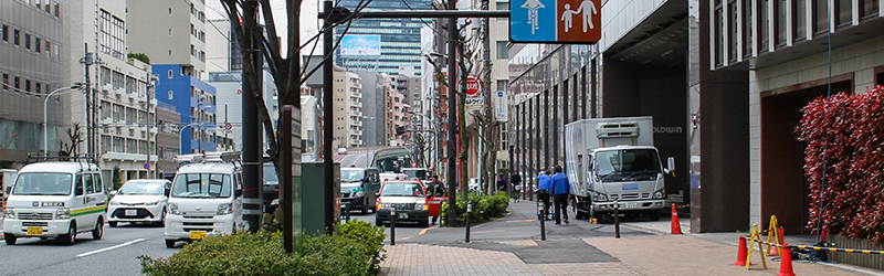
Yamate-dori is a major, heavily trafficked, road that runs all the way from Itabashi to Shinagawa. There are various somewhat similar looking segments of lanes on the sidewalk all along the route, but the section running north and south near Higashi-Nakano stands out from the rest with its length and width, clear signage, and the lovely planters separating cyclists from both cars and pedestrians. In other areas of Yamate-dori where the sidewalk is narrower, pedestrians and cyclists are separated simply with a white line and different shades and patterns of tile – which mostly fails to keep pedestrians and cyclists apart. The Yamate-dori sidewalk and lanes are very well-lit at night.
Yamate-dori has many sections of sidewalk bike paths and we evaluated it as a whole. We think it would be best if it was a consistent protected bike lane that runs along the road and connects to a larger network of protected bike lanes.
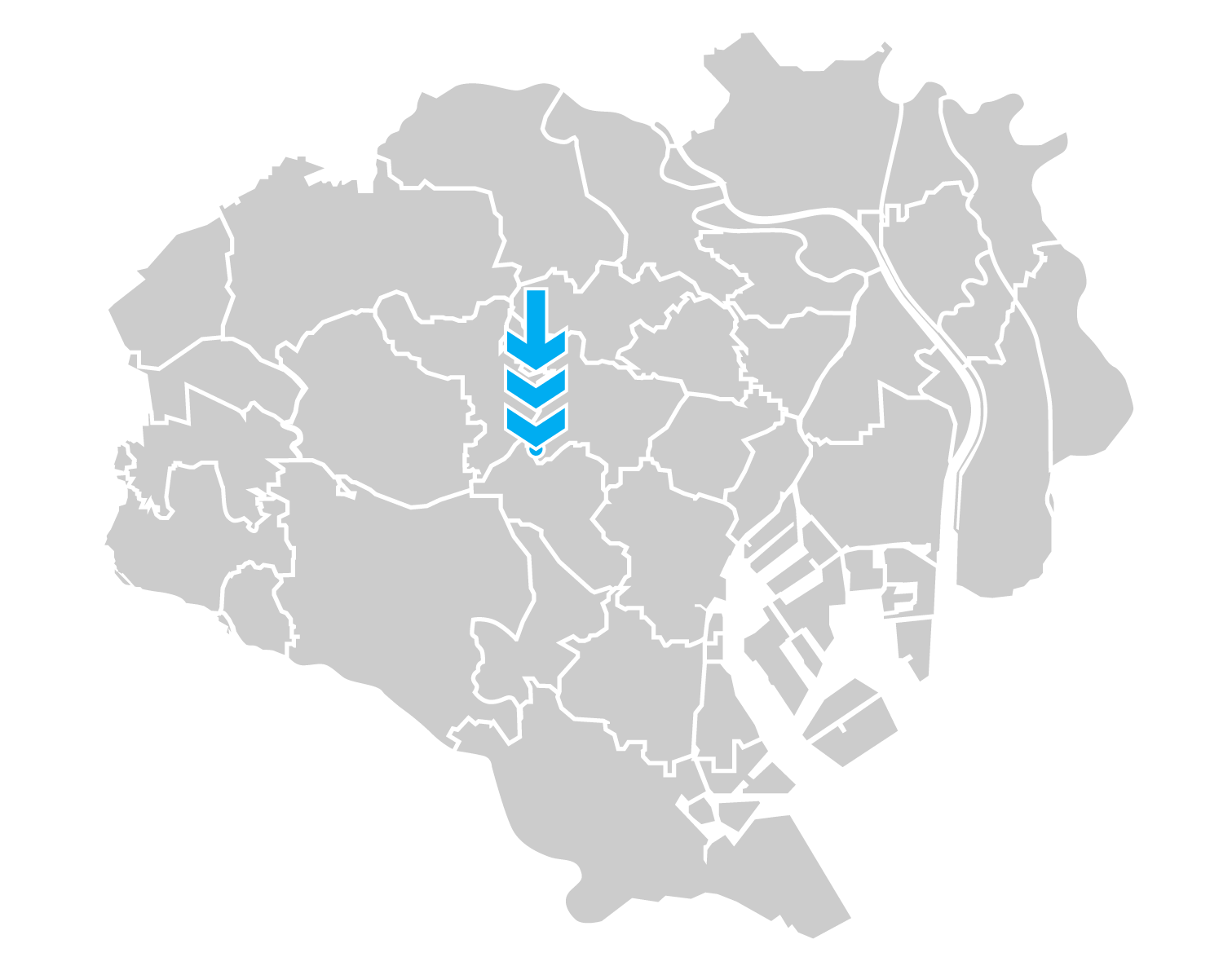
第4位 都道317号 山手通り
山手通りは板橋区から品川区に至る交通の激しい幹線道路だ。多くの区間では歩道上に自転車通行空間が設けられているが、白線と舗装の色で区別しただけの場所がほとんどで、頭上の看板や路面のマークなどもあるものの、歩行者との分離の実効性は低い。東中野付近は例外的に歩行者と自転車の通行空間が植樹帯で区分された形態が続いており、他の区間よりも統一感と連続性が感じらる。照明は概ね全区間で車道とは別に歩道を照らす街路灯が並んでおり夜も明るい。
山手通りは、車道を往復6車線とする整備計画に対し沿道住民が反対運動を起こして往復4車線への変更と幅広の歩道を勝ち取り、その結果として自転車通行空間の整備が実現した道路である[23]。設計には改善が必要な点も多いが、車至上主義の時代からの転換を象徴する事例として意義深い。
SAFETY RATING ( 8.5 ) / 安全性 8.5点
Transition Points – Yamate Dori is a long road so the bike path will vanish in some points and pick up again later. Overall it’s poorly designed and it does not indicate what to do at these transition points.
終端部の処理——距離の長い山手通りには、自転車通行空間が姿を消してはしばらく先でまた現れるという箇所がいくつもある。通行空間の設計は貧弱で、途切れた先の通行方法は示されていない。
Cohesion – The Yamate Dori bike path is connected to other bicycle lanes in multiple areas. This is a rare thing to find in Tokyo. We wouldn’t go as far as calling it a cohesive network but it has places where it connects to blue paint.
ネットワーク品質——広域道路である山手通りの自転車通行空間は、複数の地域で他の路線の車道上の自転車レーンや歩道上の自転車通行空間と接続している。これは東京では珍しい。充実したネットワークと呼ぶほどではないが、地域を跨いだ自転車移動にも使える。
Obstacles – On the Yamate-Dori bike path, one has to ride over countless curbs as they cross other streets. The path has maintenance doors on the ground only along the bike area. The lane contains utility poles at some locations, bulky plants tend to diminish the space people can feel comfortable riding in, and sometimes parked bicycles also make the space even narrower in front of businesses as there is no on-street bike parking.
障害物の有無——大小の交差点を通過するたびに縁石の段差がある。共同溝の蓋も自転車通行空間内にばかり設置され、乗り心地を悪化させている。場所によっては照明の支柱も通行空間に食い込んでいる。嵩のある植栽が通行空間の心理的な有効幅員を圧迫していることが多く、また路上駐輪スペースが用意されていないため、店舗前では自転車通行空間が路上駐輪でさらに狭くなっていることがある。
Traffic Separation – As a sidewalk path it separates the vehicular road traffic from the bicycle area but there is little done to separate pedestrian traffic from entering the cycling area and vice-versa. As the bike path is not wide enough for two cyclists to pass each other or for a cyclist to overtake another comfortably, one of them tend to enter the pedestrian area in either situation.
交通モードの分離——歩道の一部という形で整備された自転車通行空間は車道の交通から分離されているものの、歩行者と自転車利用者が互いの空間に入ってしまうことを防ぐ方策は殆ど講じられていない。自転車通行空間の幅が十分でないため、自転車同士の追い越し、すれ違いには接触の不安が伴い、一方が歩行者空間にはみ出しがちだ。
Lighting – The path is well lit by street lamps but there are places with no/little shade, where trees are not even planted for future growth and shade. Just exposure to the sun and glare off cars and buildings.
照明——自転車通行空間は街灯でよく照らされているが、歩道が十分に広い区間でも木陰が皆無に近く、将来を見越した植樹もなされていない場所がある。太陽光と自動車やビルの照り返しが容赦なく降り注いでいる。
DESIGN RATING ( 6.5 ) / デザイン 6.5点
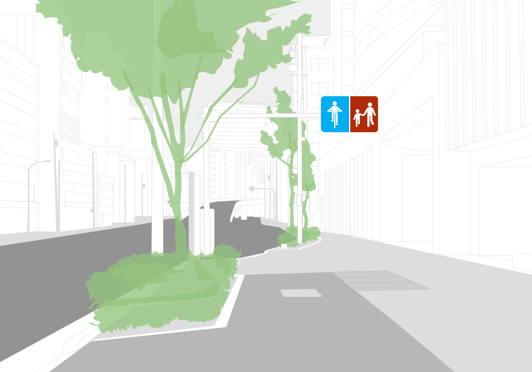
Communication – The bike path typically has overhead signs (pogostick), a light-gray surface color that makes it distinguishable from the pedestrian area, and ground markings. This light gray surface makes the markings hard to notice, which might be one of the reasons why pedestrians often walk along the road side in the bicycle path.
通行方法の伝達——典型的な処理としては通行区分を表す看板が頭上にあり(自転車ナビマークと同様のマークを使用)、路面も歩行者空間から区別できる薄灰色になっていてピクトグラムも施されている。だがこの薄灰色の路面に白いピクトグラムという配色が目立たないこともあってか、自転車通行空間となっている車道寄りを歩いている人がしばしば見られる。
Understandable – The distinction between the pedestrian and cyclist areas is indicated mostly by pictograms and can be understood by anyone, but some warnings such as “Yield to pedestrians” (歩行者優先) and “Slow down!” (スピード落とせ!) are shown only in Japanese text.
言語依存性——通行区分の表示は基本的にピクトグラムだけで示されており、誰にでも意味が伝わるだろう。一方、「歩行者優先」や「スピード落とせ!」といった注意喚起は日本語の文字情報によるものだけである。
Promotes Safety – The design separates the heavy traffic on the street with the bicycle infrastructure, and where the Metropolitan Expressway appears overground, it’s covered by noise-reducing walls.
事故防止——車道の激しい交通から自転車通行空間を分離する設計になっている。時おり車道中央に現れる首都高の地上部分は防音壁で囲われ、騒音も遮られている。
Transition Instructions – There are no clear directions about what users should do at the end of the bike lanes. When one reaches an intersection there usually is a bike crossing with some ground marking (riderless bicycle) and hiragana (じてんしゃ) but there should be clearer and more continuous directions spanning the transition points.
終端部の案内表示——自転車通行空間の終端部に、そこから先の通行方法がはっきりと分かる指示はない。交差点まで進めば大抵は自転車のマークに「じてんしゃ」の文字が添えられた自転車横断帯があるが、もっと明確で連続的な案内が可能だったはずだ。
USEAGE RATING ( 7.5 ) / 利用状況 ( 7.5 )
Popularity – It can be very busy at times. The total length of this bike path means it will be busier in some stretches and empty in others. As a whole, the percentage is roughly the same or a little bit less than the other sidewalk paths we’ve explored.
通行台数——時間帯によっては非常に沢山の自転車利用者に使われている。距離の長い道路だけに、大勢の人が走っているところもあればガラガラのところもある。全体としての利用度は、候補に含まれた他の歩道内自転車通行空間と同等か、やや低いようだ。
Broad Spectrum – As a long and relatively safe backbone of a network, this pair of paths support a wide range of users including elderly, parents with their kids on the child seats, morning commuters and delivery cyclists, but during our observation we saw few kids riding along this road.
利用者の多様性——自転車ネットワークの背骨となる比較的安全な広域ルートとして、山手通りの自転車通行空間は高齢者、子供の送迎で自転車に乗る人、通勤や配達で自転車を使う人など幅広い層の利用者に活用されているが、調査時は単独で自転車移動する子供の姿は殆ど見掛けなかった。
Scalable – Sidewalk lanes can cut into the pedestrian zone but as mentioned earlier this is not the area that needs to be converted. If traffic on the bike path becomes too much to handle they should basically take space away from the roads.
拡張性——歩道内の自転車通行空間は歩行者空間を削ることで拡張することもできるが、既に述べたように、自転車のために転用すべき空間はそこではない。自転車利用者が増えて現在の通行空間では足りなくなったら、手を付けるべきは基本的に車道である。
Majority Preference – Yes. The width is attractive to many users and the heavy traffic on the road compels users to use the side path.
通行空間の選好——大半の自転車利用者がこの通行空間を選択している。歩道全体の幅員の広さは多くの利用者にとって魅力的であり、自動車交通の激しさもまた自転車に乗った人を車道から遠ざけている。
Total 23.2 / 合計 23.2点
IMPROVEMENTS / 改善案
CURRENT / 現状
The bike path is sporadic on this road. It comes and goes and disappears when you
need it most.
山手通りの自転車通行空間は途切れ途切れになっており、肝心な所で消えてしまう。
TIPS / 改善案のポイント
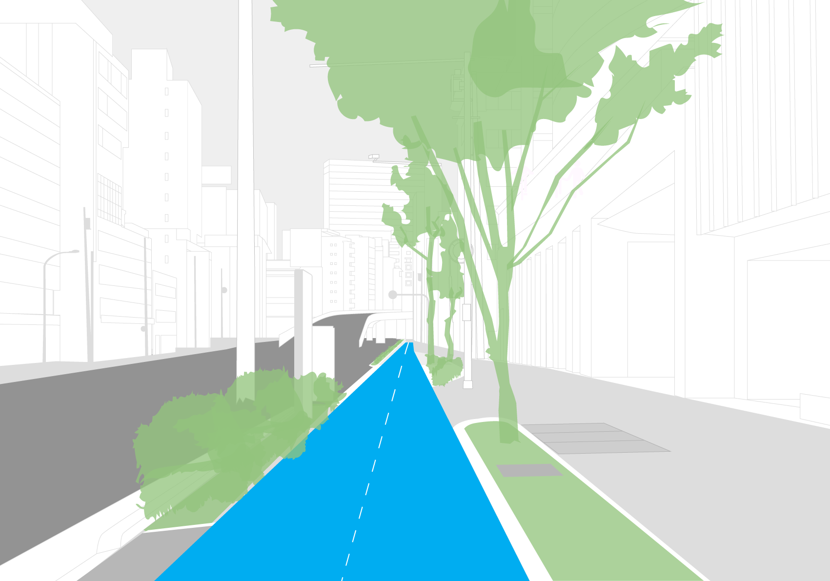
Trees should go on the divider between the pedestrian and cycling areas.
Signage and utilities should also be located on the greenery.
Use of blue paint will help alert users to the bike lane.
A wide lane will accommodate many users. This may require taking away space from vehicles.
街路樹は歩行者空間と自転車通行空間の分離帯の一部とすべき。
標識や街灯などの柱も、通行空間の有効幅員を圧迫しないよう植樹帯/施設帯の中に配置すべきだ。
青いペイントで自転車通行空間が認識され易くなるだろう。
通行空間の幅員を広くとれば沢山の自転車利用者に対応することができる。拡幅には車道空間の削減が必要になることもあるだろう。
Illustration purposes only. Feasibility studies would need to be conducted for viability for cost, local ordinances, and other unknown specification.
イメージは一例。費用、法令との整合性、その他さまざまな制約を考慮した上での実現可能性は別途調査が必要と思われる。